10 top tips for designing responsive websites


Our 10 responsive web design recommendations will help you develop a site that looks great on any device whether you're revamping an existing one or beginning from scratch. Responsive site designs are now the standard since mobile devices have taken over as the main way that people access the internet.
The good news is that developing a responsive website no longer necessitates a deep understanding of HTML, CSS, or other challenging coding languages. As long as you are using an intelligent visual web development platform, you are fine to go.
These guidelines can assist you in creating a site that functions flawlessly across a range of screen sizes and devices, whether you're working on a responsive redesign project or beginning from scratch. But first, let's define and examine the operation of a responsive website.

A responsive website is what?
When there is a seamless experience from desktop to mobile, we consider the website design to be responsive. Depending on the device and screen size being used to view it, a responsive website will alter its visual design and interactive elements. Responsive web design (RWD), a contemporary design methodology that adjusts pages to the user's screen dimensions, is at the heart of these websites.
Based on the device, screen size, orientation, colors, and other characteristics of the viewing device, RWD employs CSS to provide a variety of style elements, such as typeface, images, and menus. Additionally, CSS enables media queries and viewport optimization, enabling web pages to change according to viewport width and website layout. A viewport is the visible portion of a device's screen.

10 recommendations for responsive web design
Let's get started with the 10 best practices you can use to enhance the responsive design of your website.
1. Be mindful of your navigation
The navigation of a website is significantly impacted by responsive web design. Check out the Microsoft website from 2007:
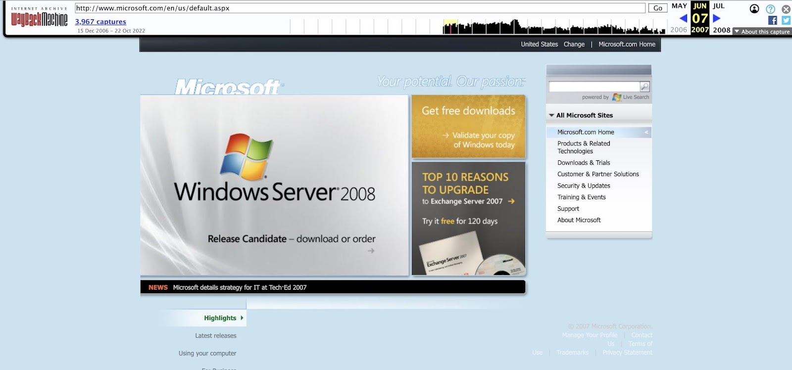
The graphics are clumsy, the typeface in the bottom right corner is low contrast and difficult to see, and all of the website's pages fit into the right-side menu.
Think about the Microsoft website in 2022:
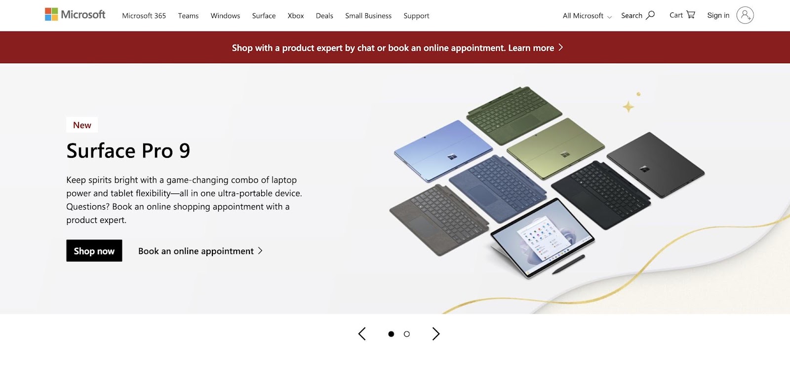
Your design must adhere to these new restrictions because you are creating it for smaller mobile devices.
When a user visits Microsoft's website on a mobile device, the advertisement is scaled to fit the screen and the navigation changes to a hamburger menu for convenience.
Only 4-5 essential links may often fit in your navigation, which has an impact on the entire content strategy and information architecture of your website. Make sure the links point to the locations that people are most likely to search for, and then provide ways for them to learn more.
To make navigation easier for users, try using dropdown menus, in-page links, collapsible menus, icons with text, and icons only. Making the main pages simple to navigate will also help your navigation. Use inclusive language, fonts that are widely available and easy to read, and alt text for photos.
Avoid making visitors to your website scroll excessively. Always keep in mind how difficult it is to return to the navigation bar on long-scrolling pages. Use a back-to-top button or a straightforward sticky navigation bar that is anchored to the bottom or top of the screen instead. On a mobile device, choose bottom navigation for one-handed use.
2. Before designing, organize your content
It is analogous to choosing a frame before you have developed a picture to design a website without a clear understanding of its content structures. In order to see the wider picture, you must determine how you will arrange the content.
When content and design are produced together, they succeed. It's critical to organize your material clearly because both components contribute significance to one another.
There is more to content arrangement than merely copying and pasting text blocks to determine where they will fit on a page. Instead, think of your content as the narrative you want to present to your audience.
Prioritize the messages you want to get across on a list, and then consider how they relate to one another. To make dense amounts of information simple to understand, consider using interactive infographics or drawing design ideas from top-notch templates. You can design your navigation bar to guide visitors through the website and ensure that their time there is seamless and pleasurable.
3. Begin by designing for mobile devices
Mobile devices account for more than half of all traffic on the internet. Regardless of their brand or operating system, these products are dominating the market.
They are also getting stronger and are fairly adept at handling responsive web designs. Instead of opening your laptop, signing in, and opening a browser, it is quicker to pull your phone out of your pocket and visit a few websites.
In light of this, be careful to design your website with a mobile phone user as the primary user demographic. This entails designing your website with mobile users in mind and giving the maximum width of available space priority. It also entails uploading high-resolution images that nevertheless load quickly and streamlining navigation with breakpoints.
Your website's mobile version does not also have to have a set width. Multiple themes, flexible CSS media queries, and frameworks that typically demand coding can all be used to create a mobile-friendly website. You won't have to break a sweat over mobile optimization because Quarkly handles all the labor-intensive tasks for you.
4. Include buttons for calls to action
Every webpage needs a call-to-action (CTA), which is an essential element. Users are directed to the next step by waypoints such as links and buttons with a call to action. Without clear CTAs, people can have trouble understanding how and where they must make a purchase or enroll in a program.
The color, style, size, and shape of your CTA button should stand out from the rest of the page. The most identifiable shapes are typically those that are circular, square, or rectangular. Stick to traditional forms when designing your buttons rather than being overly imaginative, as this may confuse visitors to the site. Make sure your buttons are finger-friendly for touchscreen devices because the size of your buttons has an impact on how users will see or click them. To reduce accidental clicks, leave plenty of space around crucial buttons and text links.
To prevent overloading your visitors, try not to use too many colors. To bring attention to your CTA, utilize something vibrant and select 2-3 colors from your brand's color palette for the website. People can be persuaded to click the buttons you want them to click by using drop shadows, gradients, and other dimension-giving stylistic elements.
5. Only employ the terms you require
More text is possible on desktops, although that isn't always a good thing. You are limited to using the smaller screens on mobile devices. This entails writing concisely, making sure that each word advances your narrative.
Use clear language that communicates the goal of your website, and use typography carefully. To prevent overwhelming anyone trying to read the site, keep typefaces consistent with your brand identity and minimize font combinations.
6. On smaller screens, typography is even more important
The majority of consumers are time-constrained and lack the patience or mental ability to fully understand your business. This is why making a website readable is crucial. Utilize typography in a way that enables visitors to take in the most information in the smallest amount of time.
Use a font that is easy to read, especially for important content such as navigation labels. Use larger font sizes to improve readability because small print is difficult to read on any screen. On desktop and mobile devices, body copy should be between 16px and 20px. Depending on the font's design, increase or reduce the size (though we advise using the em unit of measurement instead, starting at 1 to 1.25em).
On smaller screens, spacing is an additional crucial consideration. If you use too much or too little, your text will float in the air and stack up like pancakes. Make sure the line height is adjusted appropriately. The ideal ratio is typically in the 1.25 to 1.5 range, however since each typeface varies, it's best to explore first.
Check your text on various devices during the design process to see how your line height influences the text's display.
When creating for mobile, keep in mind that a larger font may cause the key information you want someone to read to appear further down on a page. Think of all the other design techniques you have at your disposal to build drama, such as varying font weights, using all capital letters or all lowercase letters, or using color to set off content sections from other page elements.
7. Appreciate emptiness
Negative space, also referred to as white space, is the area of a website's design that is left empty. Negative space gives all the items on a screen the breathing room they require. Someone looking for basic information can become overwhelmed with a full screen of loud images and enormous text and leave your page.
When employing negative space to create a responsive design, you must tread carefully. Yes, you should keep content and navigation simple, but negative space should improve the visual appeal of the website while also making it easier for visitors to read and utilize.
A crucial item shouldn't be left out, either. Use negative space to break up your design and draw attention to the content places you don't want people to miss.
8. Make a responsive prototype and test it
Understanding how your designs appear on various displays is crucial. It's also critical to comprehend how it works in practical applications.
You can get by with static prototypes for a while, but ultimately you'll need a working prototype to show you how the site will look and function. To ensure your website functions flawlessly, test your prototype on real devices.
You'll save time and effort by doing this, as well as avoid receiving sarcastic tweets claiming that your website is "broken" on mobile. A visual web development platform can make this process more efficient.
9. Use responsive pictures to stay in the fast lane
Ensure the speed of your website by using photos that load rapidly on all platforms. You'll need responsive pictures that accelerate the loading of your web pages in order to accomplish this. The ability of a website to load rapidly is becoming a more crucial factor in SEO, user experiences, and bounce rate. Someone might quit the website if it's taking too long in order to obtain their information somewhere that loads more quickly.
While photos visually resize on smaller devices, a major issue with responsive design is that they remain 3MB in size and cause load times to bog down. An excellent and powerful approach to get around this is via responsive pictures.
10. Use flexbox to power your layouts
Flexbox is a CSS3 layout plugin that makes sure your layout is seamlessly responsive across various devices. This is significant because Flexbox enables the development of responsive websites without the need of cumbersome CSS attributes and code. It makes it easier to quickly develop well-liked design patterns like equal-height modules and Z-pattern feature lists as well as complex layouts like split screens, sidebars, and hero covers.
Giving a parent container the display setting of "flex" and choosing how the children within it are distributed will enable you to use flexbox. Though it appears straightforward in theory, it offers substantial flexibility.

The web is better off thanks to responsive design
The large amount of space allotted for desktop designs frequently resulted in extraneous visuals and content that distracted from a site's main purpose. Now, the prevalence of tablets and mobile devices has completely changed how we create and use websites.
In the end, the device we use to see a website determines how we design and interact with it. We may remove unnecessary elements with responsive design so that everyone can discover what they need more quickly.
All you need is a tutorial and some inspiration to design a website; it doesn't have to be complicated, and you don't even need to know how to code. Once you've overcome the learning curve, it won't take you long to create a ton of gorgeous websites.