Guidelines for Website Navigation Design


Your website's navigation, which you may not have noticed, is the key to its success.
There isn't much a well-planned online navigation can't enhance, from how well you perform in search optimization to how user-friendly your website is to how likely visitors are to convert.
With all of this in mind, it's imperative that you always adhere to the most recent navigational best practices while creating the navigation structure for your website.
In this manual, we'll introduce you to the foundations of website navigation, discuss its significance and influence, and show you how to arrange your website the most effectively.
What is the navigation of a website?
Website navigation is simply the process by which visitors can go from one page of your website to another.
They are given links in a variety of formats to follow until they locate the appropriate content, which accomplishes this.
However, once you begin creating your own websites, you'll realize that creating navigation that makes sense requires a good lot of artistic skill.
You might want to direct users to content you'd like them to interact with, or you might want to make it as simple as possible for them to find a certain page. In any case, you must utilize the proper navigation to keep them on course.
Later on in this book, we'll provide you some pointers to make sure your navigation is optimized and caution you against some of the most frequent navigational blunders.

Why is effective website navigation important?
Let's examine the three main sections on your website where navigation is most crucial.
User experience
A user-friendly website navigation system makes it quick and simple for them to find and access the information they need on your website.
Navigation should be at the forefront of your mind when you begin to consider your user experience. Make all pages accessible through browsing or search, and make it simple to find popular pages.
Optimization for search engines
Your website's navigation design is being examined by more than just human visitors. Bots, or little pieces of code, are sent by search engines to browse your website and evaluate your content.
When you organize your website with search engines in mind, you make it simple for them to comprehend not only where to find all of your material, but also what's behind each link.
They can index your website and bring you the proper kind of visitors more easily as a result.
Conversions
Poor navigation can affect your bottom line in addition to confusing users and bots. Your navigation structure should direct users to your converting pages if you want to boost conversions.
Websites that are conversion-focused direct visitors toward conversions, never letting them get lost or distracted.

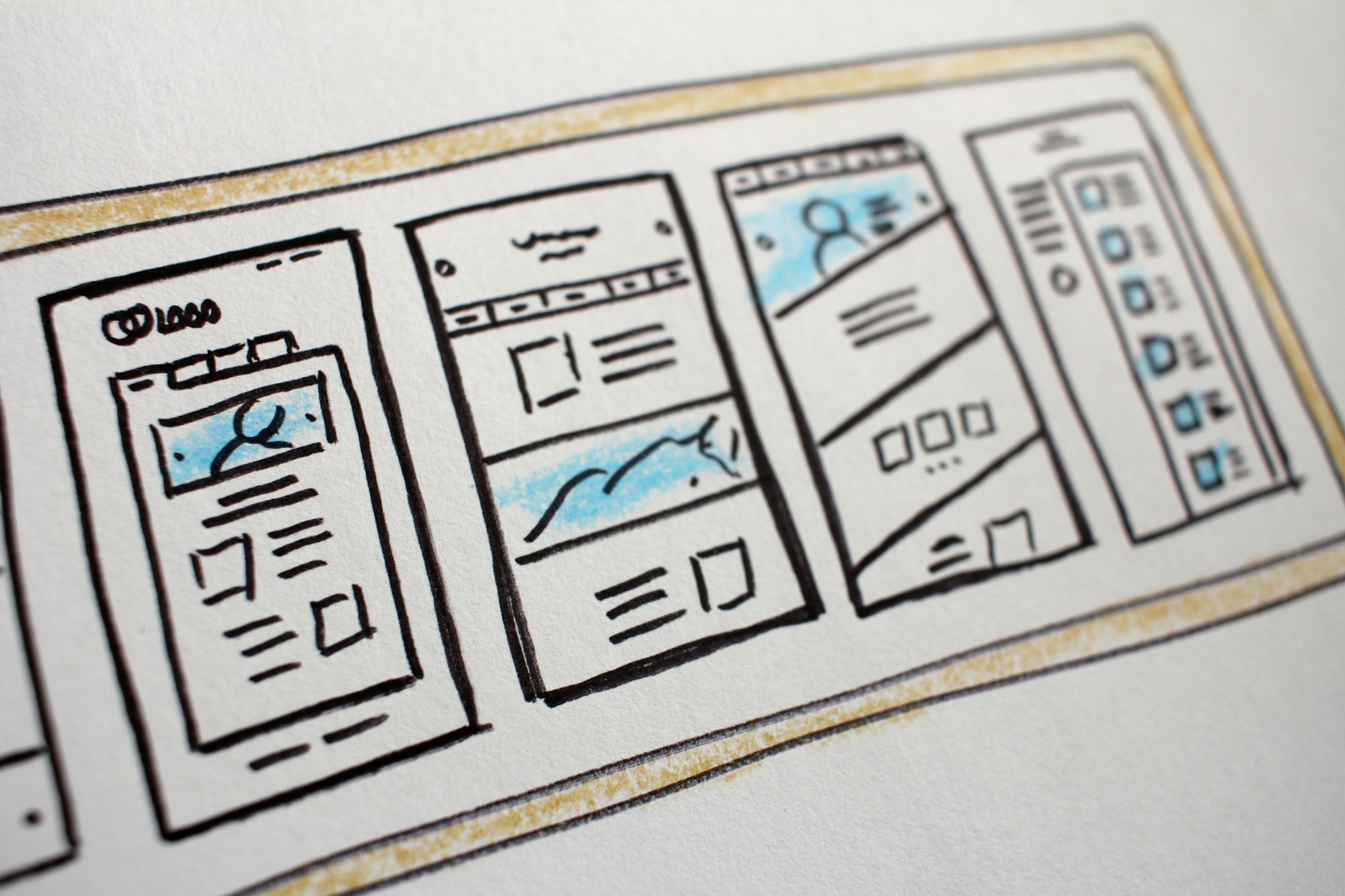
Various forms of website navigation
The majority of websites allow visitors to browse their pages in a variety of ways.
You can read brief descriptions of some of the most typical navigation components on websites down below.
You should be well-aware of your alternatives for building a navigation system when establishing your own website and know which navigation tools are best for your requirements.
Navigation bar
The horizontal navigation bar in the page header is the most typical design for a website's navigation menu.
The most significant sites on the website are linked from these bars, which present them side by side for users to choose from. They can be compared to a website's horizontal table of contents.
It's typical for the links in the navigation bar to stay the same on each page of a website, facilitating easy access to important sites for users.
Dropdown menus
Dropdown menus, as their name suggests, are a type of navigation menu in which links are displayed in a list that slides down when you click or hover on a page's component.
Drop downs are a good solution if you have a lot of content on your website and want to make it easier for people to find what they need without overcrowding the page with navigation links, even though they are not advised for routine navigation.
Typically, a dropdown menu will include top-level categories listed as the main menu, followed by sub-categories and connections to content.
Footer
Navigation menus called footer menus are found at the bottom of a web page. if a user is seeking for a link that is not there in the navigation bar.
Function links, like terms and conditions or privacy policies, are typically included in footer menus.
More menu items will typically be listed in footer menus than in the navigation bar. This is because site designers don't worry about the links interfering with the user-friendly design because they're at the bottom of the page.
Sidebar
Similar to a horizontal navigation bar, a sidebar is a vertical navigation bar that runs along the side of a page, with menu items stacked one on top of the other.
Using a sidebar as your primary menu is an interesting choice because it deviates from the norm and is less familiar to users.
Sidebars add a distinctive look to pages and make it possible to display additional menu items.
Some sidebars will extend over the entire page to provide visitors access to more options.
Breadcrumbs
Breadcrumbs, also known as breadcrumb navigation, are a means to give users a visual representation of where they are on your website and the route they have traveled to get there.
A breadcrumb layout, which is a nod to the classic fairytale Hansel and Gretel, makes it simple for users to navigate back and forth between your pages and subpages.
With greater than (>) symbols separating them, breadcrumbs are typically laid up with higher-level pages on the left (the top-level page being the farthest left) and lower-level pages on the right.
The links at the top of the page allow users to swiftly return to earlier pages.
Internal linking (in-content)
An essential, if less formalized, navigation mechanism is linking from content on your pages.
Instead of being in a menu, links are dotted throughout material, pointing visitors to words or phrases that are associated with other content on your website.
Content links create the appearance that all the content on your website is connected and make it simple for people to access more information on a certain subject.

Best standards for navigation and user experience on websites
Let's look at the crucial website navigation best practices that you should adhere to when creating your own website now that you have a solid understanding of what website navigation is and its features.
Although the previously discussed navigation parts each have their own best practices, in the section below we look at the overall website navigation best practices.
The user experience, search engine performance, and ease of keeping track of your pages and content will all be improved by keeping them in mind while developing the web navigation for your own website.
Make sure to keep track of each one and use it when it makes sense.
1. Avoid starting from scratch
While it's true that excellent website design involves using creativity and attempting to provide website visitors with a memorable experience, there are many benefits to adhering to accepted standards when developing your own web pages.
Visitors will anticipate this when they access your website on a smartphone if every other website uses a hamburger menu for mobile navigation.
You're asking visitors to take an extra few milliseconds to figure out where to click if you include an arrow or any other unique element.
Always keep in mind that the purpose of web design is to make your website's navigation as simple as feasible for users to grasp. Curveballs are a guaranteed way to drive away visitors and, as a result, drive away conversions.
2. Make navigational components distinct and clear
It may seem like some of the most basic advice you will ever hear about website navigation, but it's still important to note: you should make sure that all of the navigation-related items are easy to view.
A well-designed navigation menu is useless if all it does is keep people from seeing it. First and foremost, make an effort to prominently position menus, links, buttons, and other navigational elements on your pages.
Consider yourself to be a user. Consider where you would want to go on each page and where you would expect to find navigation options.
Use a heatmap tool to evaluate if your links, buttons, and menus will draw visitors' attention if you're unsure as to whether they're positioned effectively and clearly.
Text links should be in a color that contrasts with the rest of your material.
3. Create responsive menus
If you haven't yet immersed yourself in responsive web design, you should because a large portion of your website's users will be using mobile devices.
When a website is responsive, it can display each page and its contents in the right way on any size screen.
The hamburger menu strategy is one that many websites adopt to make their navigation menus more responsive. On a mobile device, using a drop-down hamburger menu as the primary navigation keeps the screen free for content.
Remember that responsive design isn't simply about user experience, even if your target audience utilizes desktop computers primarily. Your website's mobile friendliness will also be taken into account when ranking you by the bots used by search engines to crawl your site.
4. Be dependable
Using a consistent navigation design language throughout your own website is just as important as ensuring that the navigation design on your website doesn't deviate too much from that on other websites.
For instance, visitors can reasonably expect to see a hamburger menu in the upper right corner of every page if you start with one there on your home page.
Or, if a link to your product pages is already in the page's header navigation menu, don't abruptly place it in the page's footer.
Websites that are user-friendly tend to have straightforward navigation. They give visitors instructions on how to browse their pages as soon as they arrive and maintain this throughout their visit.
Making sure there are no surprises is key.
5. Be specific
In keeping with the idea of avoiding surprises, you should also make it a point to make sure that each website navigation element you employ represents the content of the page your visitors are traveling to in a clear and understandable manner.
Any links on your website that users don't know where they're going to will probably raise suspicion in their minds. When they click any link, they should feel confident in their understanding of where they'll land.
Making your navigation components descriptive has another benefit for SEO: by making it simpler for search engines to index your website, visitors will have an easier time finding you.
If you're not sure how to make the links and buttons on your website more descriptive, you can consider adding one of the following:
- The title of the linked page
- An overview of the material on the page that is linked to
- An outline of the activities visitors can carry out on the linked page
6. Distinguish between calls to action and navigation
A call to action is a link that typically takes the shape of a button or banner that urges users to perform an action (usually to convert).
They stand out from other website navigational components in that they guide visitors in a new direction rather than just making it simple for them to access the stuff they were already looking for.
They ought to be distinguished from other key navigation elements in this way.
For instance, your home page might have a primary navigation menu at the top, navigation links in the footer, and then a variety of other connections throughout its content.
However, you should employ a call to action to guide visitors toward a particular page if you really want them to do so.
To make them stand out, think about utilizing banners or buttons in contrasting colors.
7. Minimize clicks
Even while it's wonderful to provide visitors with a variety of navigation options, you should work to reduce the amount of clicking required.
The idea of a website's navigation being a trail is helpful. The least amount of clicks necessary should separate your website visitors from the information or action they seek after they land there.
Links to well-liked or significant material should be included in your main navigation menus for this reason.
To determine which pages on your website receive the most traffic and what your visitors are looking for, use tools like Google Analytics. After that, you may include links to these sites in both your primary website navigation menu and conspicuous locations on other pages.
Adding search navigation options will enable users to access the desired content quickly.
Bad navigation is what? What must a website's navigation design stay away from?
Generic anchor text
Recall how we said that one of your navigation elements' most crucial qualities should be description? Using excessively generic wording for links is one of the most prevalent errors committed by website owners.
In addition to making it difficult for people to grasp what is behind a link they are clicking, generic content can also reduce the ranking of your website in search engine results.
Whatever you do, keep these or similar phrases out of the link you create:
- Click here
- Find out more
- Link
- More information
Make an effort to precisely define the link destination in the available space.
A cluttered navigation bar
The user-friendliness and slick appearance of a navigation bar are severely hampered by having too many navigational options.
A header navigation bar is meant to make the most significant or frequent links that you want visitors to click on easier to find.
Users will search for their necessary links for a longer period of time if you add too many items, and your page design will look less professional overall.
Consider moving some of the less significant links to the footer menu if you discover you have an excessive number of links.
Extensive drop-down menus
Although drop-down menus are useful for site designers to conceal a lot of links, users frequently complain that they are inconvenient.
Additionally, if drop downs include too much content, it makes them difficult for visitors to use.
If you must use a drop-down menu, make sure to keep it brief and straightforward. Submenus should be used sparingly and only when absolutely essential.
Broken or mislabeled links
Have you ever tried using a website's navigation only to find that the link you're clicking leads to the incorrect page or doesn't even leave the page you're on?
So you've seen broken or incorrectly labeled links.
These happen when a website's creator doesn't take sufficient care to ensure that the links they are adding send people to their intended destinations, or when they change pages around or delete them without eliminating links.
Several things can be done to prevent this:
- When adding a link, double check to make sure it operates and directs users to the intended page.
- Utilize a link checker tool to periodically examine the links on your website.
- When you delete a page, take care not to forget to remove the links.
Unneeded links
We've discussed a lot about the different types of menus you can use to offer links, but we haven't covered much in terms of selecting links to put there.
Users should be most likely to find the links that are placed in the most noticeable locations in navigation bars and menus.
Making inaccurate assumptions about what people want or just placing undesirable links in key navigation locations are two common mistakes.
Users will not only be less likely to click on such links as a result, but they will also take longer to find the links they are looking for.
This might be a continuous procedure. Keep track of which pages on your website are the most often visited ones, then place links to those sites in prominent locations in your navigation menus.
Inconsistency
Consistency is essential for creating a website that is both appealing and functional. As we've already discussed, consumers should be able to navigate your website without encountering any surprises.
Because of this, breaking one of the most prevalent principles when adding navigation to a business website is a mistake that happens frequently.
The top navigation bar's propensity to modify the links it offers from one page to the next is the main problem with this. Users may as a result click links they did not intend to click or have trouble finding the website they are looking for.
One of the easiest errors to avoid is this one. Simply make sure that the design and organization of your navigation links are consistent throughout your website.